A friend of mine turned me on to these guys back in college. I believe the album From The Screen to your Stereo had just come out. There is quite a bit of energy in there music and i wanted to try and capture the feeling of a group of guys that like to hang and have fun together. The sketch was of a kid playing superhero with his cape and don't mess with me stance. Which when translates into older guys in bands striking poses on stage right. It was a fun parallel, at least i think so.
Hated that i was not able to take in the show. Its lame but my age was catching up with me. Couple of late nights back to back printing the poster left me with a massive headache the night of the show. The original design was supposed to be another 2 color job that looked like a three color. Where the blue and yellow over print to make green. I had forgotten that's not really the case from my days of mixing paint in intro design classes. Needless to say that the blue was more opaque than i thought it was gonna be. So what are you gonna do. Call it a night, right. While i laid in bed i kept trying to think of another way to fix the poster.
I had the thought to paint out the rest of the yellow screen and reprint the areas that should have made green. Printing Yellow over green doesn't make green either. "Blast it!" Ok , now what, oh i have some green ink left over. Brrrilliant! It worked out pretty well for the poster i think.
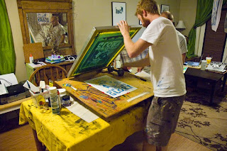
Here are some process shots and sketches.
Josh Rivenbark and Brent Holloman came over to lend a hand in the printing process and see how things happen. Lots of fun.


Still have a few of these here at the house if anyone is interested. Thanks for stopping by hope you enjoy.
Doc


Looking good w/ that addition of the green.
ReplyDeleteI think I like your original concept sketch the best. That would've made a great poster image. It has so much more life/energy.
Good work!