10.8.11

Hopscotch Posterscotch

So as many of you know, music and art are two of my favorite things. I found out about this event called Hopscotch through the wonderful peeps over at Gravity Records. Matt Keen is a social media giant, as well as vinyl enthusiast, who turned me on to the event one day in a tweet.

Hopscotch Music Festival is a 3 day music through down. This years even is being headlined by Flaming Lips and Guided by voices. They also announced the first POSTERscotch to coincide with the Hopscotch Festival. Posterscotch is basically a way to promote local North Carolina Artist who specialize in the Gig Poster realm. To kick off the inaugural event they opened up a contest for any North Carolina artist to put together a poster for the event. The only stipulations were it had to contain the dates of the event, Raleigh and Hopscotch Music Festival.

Here are all the posters that were entered. It was a long weekend of tweeting and facebooking friends to try and round up more votes. There was quite the battle for facebook dominance before a victor finally emerged. Finally with a lead of only 15 votes a poster was announced the winner and participant in a gallery show showcasing the talents of 9 other NC artists. It was Gravity Record's own Sarah Parson, 1/2 of the Posterhound Family Workshop.

I put up a fight and came in third, but was able to celebrate with Eric and Sarah over pancakes this week. We talked about the poster and we taped together the film and began to burn the screens to make her Hopscotch poster. Be sure to check it all out this coming Sept 8-10, 2011.
Many of my sketches can be seen over on my Dribbble page. But here are some other shots of the process and my contribution to the contest. Maybe i'll have better luck next year with rounding up some facebook love to make it into the galleried exhibit. So start spreading the word folks.

Here is my initial sketch, followed by a refined sketch to try and figure out where the type should best be seated in the poster. And of course the final image that was lovingly crafted.


If you're like my wife, you wondering what the crap a cat in a space suit has to do with anything. I've also heard someone ask "I always do wonder, though, why gig posters are so hard to read whilst walking by?" Well the way i see it is simple. You have this wonderful area of space that you get to create within. You can make the type huge so you can read it across the street OR you can make a compelling image that will catch someones eye and cause them to travel across the street to take a closer look. At that point you have them. They are visually digesting the poster and Oh look, there is information about a show coming up. Being an illustrator at heart, i will always put images over type. Well unless its beautifully crafted hand rendered type such as the likes of Jessica Hische. Then you can have a big poster where the info is center stage, cause really it is an art piece by the time she gets done with it.

So back to "Why a can in space?" So basically that is summed up with this...Flaming Lips are headlining. Period. I felt that the sky was the limit for this based solely on the fact that they were headlining. The Flaming Lips are so creative with there live performances and music that i wanted to try and create something that would lend itself to being part of there act or something. I mean when you hear stories of fans bring them there poop and talking about it like some sort of experience and right of passage, a cat in a space suit seems sorta tamed right?


Thanks for stopping by
Till next time,


Doc

26.6.11

Enjoying My Fifteen Minutes

Ok, so this is a shameless plug...but Brian Tucker over at the Star News here in Wilmington NC has put together an article that talks about a few of my posters. I am proud of it and wanted to share it with you.


I was very impressed with Brian Tucker as we talked about the articles and artists that he has written about. Tucker impressed me as a guy that acknowledges that there is more going on around our community than we know. He wants to take time to help shed some light on local creatives and given them a bit of a platform, even if for only those coveted "fifteen minutes".

Thank you Brian Tucker for taking an interest in my art/posters and putting the article together. It feels good to know that my work made you stop and pause for a moment. I hope that i can help give a platform to others and encourage them in there endeavors in the future as well.

TTFN

Doc


PS
Here are an article of showcasing some more local talent from my buddy Jeff Bridgers. Amazing what this guy can do with some metal and heat.

Enhanced by Zemanta

27.5.11

Hopscotch Music Festival

Ok so Hopscotch is coming up and has opened up a poster competition. I, of course, am going to enter and try to win a spot along side a few other Native NC poster designers. I have had the pleasure of meeting Chris Williams, of the Plastic Flame Press, who does some really wonderful work.

Right now in the process of sketching out some ideas and trying to refine the poster entry. I'll keep updates coming as i can get to them.

This might be suicide to share with all the talent floating around out there but here is the link with the details to the poster submission.

TTFN


Doc

3.4.11

The Avett Brothers Return

Well i must say it's about time. I feel like maybe we had done something to upset these guys. I'm sure in reality its just when you're so stinking popular everybody wants to invite you over to there place. Well all that said, i want to share some of the process sketches and screen printing process with the most recent poster project of mine, namely the Avetts.

So, i believe this idea popped into my head back in late January while Julie and i were driving up to the NC Art Museum to take in the Norman Rockwell exhibit. (It's your own fault if you missed it because it was an amazing show!). So i grabbed the moleskin and brain dumped it in there. Then refined the sketch a bit to get it to more closely resemble what i was thinking. Finally tightening it even further to where i would take it into the computer.


Yeah for paper. It's Fres... Frezech...It's Delivery and it's French!


1st color laid down was the green. Not 100% what i was trying to match. Originally, i had a more muted green. In light of the Azalea Festival, the brighter green seemed to be more appropriate. Everything seemed to bloom and sprout the last week in my back yard with that new green growth. Maybe that's where it came from.


Moving in on the second color. I am finding blues to be very difficult to work with as a color that overprints transparently. This lighter blue was far to opaque. I imagine it would be due to the white ink i used to lighten it. This blue was to have more interaction and play off the the green underneath.


Batman was along for quality control. Thanks for the help ole buddy. He showed up after the light blue was mixed though.


Here is the final shot of the 1st and 2nd colors laid down. Overall, I' still stoked as to how it is going.


After the issue with the light blue i added quite a bit more extender to the dark blue ink. The ink got it to be pretty watery with all the extender, so i let it sit out side in the sun to thicken it up before printing.


A real quick shout out to Matt and Zach of Almost There Productions as well as Matt and Eric of Gravity Records. Thanks for the support and encouragement and helping make this poster possible.

The good ole print station table top with some more character added today.


A few weeks back, I was super stoked when i stopped on the Grammys and heard them say "Coming up next the Avett Brothers." Again, it's wonderful to see these fellas doing so well for themselves and getting recognized in the music world. They have been paying there dues and using good ole work ethic of elbow grease and nose to the grind stone to get to where they are. I am glad, heck proud, to see it paying off for the "little guys" or "underdogs." I remember seeing them at Chico's there in Greenville as i was wrapping up my BFA at ECU. It sometimes seems like a long time ago and other times, like yesterday. CD's out of a little antique suitcase. All the art drawn, of course, by Scott.

On a more serious note about the Avetts, i want to share some thing that will be an insight in to there lives and character. Check out the making of the 2011 tour poster. It may just be me, but you don't get much more humble than creating a tour poster that includes all of the crew that helps make playing for sold out shows possible. Then painstakingly carve out a 5' x 2.5' piece of linoleum. It also warms my heart to see the halls of ECU's art building and Mr. Ehlbeck standing there at the Printmaking studio doors. The fact that Scott has stayed in touch with Michael Ehlbeck over the last 10 years while on the road and making records proves how down to earth he is. Thank you Avetts for your music. Thank you Scott for your art, respect for those that taught and encouraged you and for being an example to the rest of us in those regards.

I look forward to following the Avetts for quite a while more. I'd like to think a bit much of myself right now and say that we, as fans, are part of the 2011 tour poster. Is it a stretch to think of us fans as the wheels on the wagon? The music would exist but would it move like it has all over the country. May we be tried and true fans and give the Avett Brothers an audience for years to come as they continue to create more of that heartfelt "post civil-war modern rock" or "grungegrass" or what ever we want to call it.

In case you missed the performance on the Grammys here is a write up and video about the Avett Brothers appearance.

Bob Dylan Joins Mumford and Sons and the Avett Brothers at the Grammys (spinner.com)


TTFN


Doc


PS
If you're attending ECU as an art student, for crying out loud take a course with Ehlbeck, you owe it to yourself. Remember don't whine just do what he says and put some effort into the class.

While I'm at it and reminiscing of art school, thanks to all of my professors for the wisdom and effort you shared and invested in me. Especially, Craig Malmrose, Ray Elmore, Joan Mansfield and of course Michael Ehlbeck.

The Love Language - The Final Poster

Just realized that i never posted any of the final poster shots for the Love Language poster.
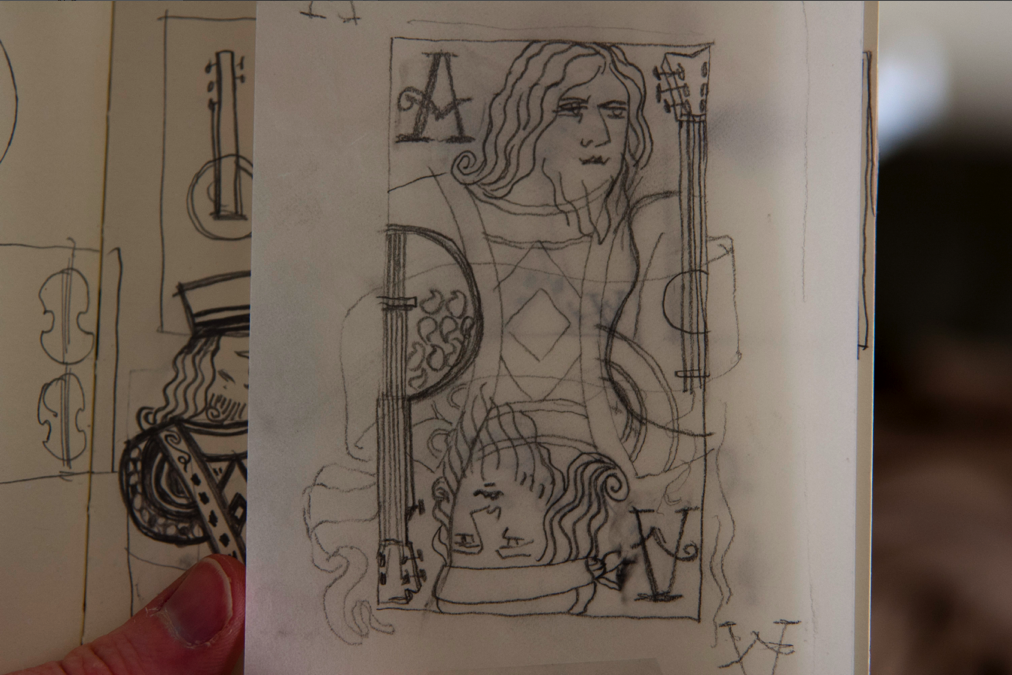
Here are a few shots of the final (which are available in my etsy shop) pages out of my sketch book with some various type treatments that i was playing with as well.


Thanks for stopping by


TTFN
Doc
Enhanced by Zemanta

1.4.11

Inspired Links

Sorry it's been a while since i've posted anything. I have been hard at work trying to finish up the Avett Brother Azalea Fest poster. The art is complete and i'll be printing the the poster this weekend. Till i get some posts of the art and all for the Avett's Poster her are some images that have tickled my fancy recently.

This lovely Cake Poster is brought to you Aaron Eiland.


This lovely art print was produced by the wonderfully talents Two Arms Inc.


Elegant quote thoughtfully illustrated by Sebastian Lester.


Another simple, conceptual poster print from Olly Moss.


Another simple visual solution brought to you by Frank Chimero. There are a series of images for the states. stop by to see if he created one for your state.


The final post for today is from Brittney Lee


I hope that you enjoy these images as much as i have. My they trigger some idea in you mind and help bring about some wonderful pieces.

TTFN

Doc

24.2.11

The Black Keys Posters

No i am not currently working on a Black Keys Poster. I would love to work on one so... maybe i can pull off some Black Keys goodness.

Why do i bring this up, you ask? The wonderfully talented Mr. Stevens created some wonderful Black Key prints. Personally, posters based on lyrics always seem to make for intimate and intriguing imagery.

Here are the two posters that he decided to print, the Half and Half team took care of the printing.


Please hop over to check out his work. He holds down the 9-5 over a Hawse Design. Again a truly talented group of artists and designers. Case in point, the hilarious and magnificent Joey Ellis helped Matt Stevens take home the Best in Show ADDY Award last night. The sensationally crafted 2nd Annual Guts Campaign was a shoe in for this award. Glad to know that the judges know talent when they see it.

Till next time

Doc