13.5.13

Old school talent

I found this a while back and it struck a cord. When it struck that cord again today after a friend passed it along to me i thought i should share it.  Knowing that so many of us "artists" have taken the plunge into the digital world, its refreshing to see a glimpse of the passion and time that it takes to craft a one of a kind piece of art with your hands. I know that there is the argument out there that designing is crafting with your hands. Having been on both sides of the digital and analog fence, i find myself longing to get out from behind the computer and sketch, paint and print.

You can see in this video how the two worlds can and do work together beautifully. This video encouraged me to continue working in both while striving to push my creative boundaries. I hope that you enjoy and are inspired to continue to stretch yourself


The Making of John Mayer's 'Born & Raised' Artwork from Danny Cooke on Vimeo.
David A. Smith is a traditional sign-writer/designer specialising in high-quality ornamental hand-crafted reverse glass signs and decorative silvered and gilded mirrors. David recently produced a wonderful turn-of-the-century, trade-card styled album cover for popular American singer/songwriter John Mayer.

This film captures the 'Behind The Scenes' creation of the 'Born & Raised' and 'Queen of California' artwork, as well as 2 unique reverse glass panels, hand-crafted in England by David A. Smith.

Music by John Mayer www.johnmayer.com
A Film by Danny Cooke www.dannycooke.co.uk
Featuring David A. Smith www.davidadriansmith.com
Special Thanks to Sony Music and Columbia Records

To watch David's original documentary, http://www.vimeo.com/14985356

12.5.13

Expanding in 2013

Its been a while since my last post and things have been staying pretty busy here. So much so that there has not been to much time to do screen printed posters. There has been some screen printing but that is another post all together.

Tonight i'd like to share with you a project that i was working on back in Feb and March of this year. It all began back in the early part of December 2012. I got an email from the managing editor at Engadget, Darren Murph. He was writing to see if i'd be interested in putting a proposal together for a conference that Engadget were putting together. Needless to say i was over the moon to put together a proposal for them. There was quite a tight turn around time attached to this project. Roughly 2 weeks from start to finish to prepare the logo proposal and submit a final.

Here are a few of the roughs that were put together leading up to the final. You can see the progression of the mark and how it took shape.


I was trying to convey the how much technology changes. The more research i collected on engadget and what they do the more i realized that Expand(ing) was probably the best way to describe technology. Nothing seems to stay cutting edge very long. In the second image above i hinted at this with the "onward and upward" arrow as part of the X.  The images beneath was simply to take the "power icon" and rotate it so that it read as a very stylized "E" or "e" (it really worked as both, I personally saw it as an uppcase that kept in line with the rest of the uppercase letters).

After some client feedback we ended up combining a few elements. Which i was more than happy to do after being inspired by an article written by Armin Vit, of Under Consideration. It hit a nerve that i think more designers should really evaluate. You can read that article in the archive of Under Consideration here.

The final submission to the board for review was to incorporate the arrows coming of all ends of the "X". This was added to the smoother dimensional text to create this mark below. In an effort to try creating a more original x with arrows i kept the on moving forward detached. This again nodded to our constant reach to grasp the stars. 


I am pleased with how the logo plays to the parent brand of Engadget. This was part of the art direction that was given, "Needs to play nice with the existing Engadget brand".


Borrowing the blue color palette was the starting point. Carrying the rounded edges over was a subtlety that i felt needed to be passed down from the parent. One final detail that was decided upon was to keep the lowercase "e" of Engadge's logo intact. We did some iterations that tried to incorporate the "signal" element of the Engadget logo, but in the end were removed for simplification purposes.

There is plenty more to share with you about the conference that followed. It was held in San Francisco over March 16th-17th. Here is a review that Engadget put out and some numbers to take a look at.
  • Number of registered attendees: 1,965
  • Number of speakers and panelists on stage: 52
  • Number of stage sessions over two days: 24
  • Cameras rolling on the stage: 7
  • Number of exhibitors: 42
  • Exhibition area in square feet: 50,000
  • The battery-life of Boston Dynamics' BigDog on an experimental electric bike power pack: 8 minutes
  • Feedback period on Lenovo's ThinkPad redesign prototypes: 18 months
  • Lengthiest commute to Expand for an Engadget editor: 6,910 miles
  • Number of Insert Coin finalists invited: 13
  • Insert Coin: New Challengers grand prize total (awarded to Ziphius): $20,000 (plus $5,000 Reader's Choice prize)
  • Number of products given away on-stage: 64
  • Price of the MakerBot Replicator 2: $2,200
  • Tweets covering Expand SF 2013: over 5,000
  • Number of Engadget Expand posts during the event: 74
  • Number of arcade machines at our opening-night party: 67
  • Wager between Engadget Editor-in-chief Tim Stevens and Piper Jaffray's Gene Munster on that long-rumored Apple TV hardware appearing this year: $100
Thanks for stopping by more to come.

7.1.13

If you are a creative problem sovler, illustrator, designer of any stretch of the imagination,
please do yourself a favor and read this post from John Hendrix's blog: Drawing on Deadline.


THURSDAY, JANUARY 03, 2013

How To Find Your Voice


Tonight I'll be speaking at Society of Illustrators with Aaron Duffy, a former student I had the pleasure to teach during my first year at Washington University. You can see much of his touching and moving work here. When I met him, he was a very stubborn and driven student, with distinct (if not totally clear) stories that he wanted, or indeed, had to tell.  Today, Aaron's work shines for its singularity and heart, in a field where clear voices are often diluted in risk-adverse corporate advertising. He is an example of the kind of student that I love to teach. He was never afraid to take the risk of solving a problem in his own language. Ultimately, even when given limitations, Aaron created the problems he wanted to solve. Tonight, through our recent work, Aaron and I will be talking about these two questions.

From a student: How do I find my voice?
From a professor: How do I teach others to find their voice?

As someone who has experienced both sides of this equation, let me share a few thoughts about searching, discovering and knowing when you've found your own voice in your work. 


Illustrators and commercial artists often make the mistake of being too good at solving the problem. Meaning they let the limitations of the project overly influence how they solve the problem. When I give my student's an assignment I always tell them the same thing."At any point in this assignment, if you are unhappy with what you are drawing, it is your fault. Not mine." Illustrators, not art directors, are in charge of designing content that they will love to create. You can start simply: make a list of things you like drawing. My list looks something like this... 

Bridges collapsing
Foxes having tea
Goofy hats and beards
Ray guns
Cute robots
Ugly robots
Boats sinking
WW I gear
Animals with swords
Magic fish
Unmanicured trees
Holy things
Old presidents and kings 
19th Century misunderstood abolitionists
on and on...

Make a list that has 100 things on it- and pin it up in your studio. Make a habit of inserting these subjects into your drawings and, even better, into your illustration solutions. Learning to solve a project in a world that you enjoy is a huge part of finding your voice. The reason why is so simple it almost escapes notice:  When we make things we enjoy, our work gets better.



Marshall Arisman has spoke about this at length for years, including at ICON7 last June, and I will echo his wisdom. His MFA program at The School of Visual Arts was founded on teaching illustrators to no longer define themselves by their assignments. Illustrators from the 60's and 70's (the golden age of agency illustration) languished in the late 80's and 90's because they were not trained to be authors of their own material. These illustrators had become great craftsmen and great thinkers as well, but when there were no assignments given anymore, they grew bitter and unable to generate work without a client's prompting.

I teach my students to be, ultimately, what I call First-Order-Creatives. Now, before I clarify this statement, let me say that this structure has nothing to do with inherent value or skill sets required for each.  

Third Order Creatives: Manifesting Content
A visual creation that is only concerned with forms. The artist is hired to deliver art and nothing beyond the created objects.  
Some examples:
• Rendering fur/textures on an animated film
• Drawing a castle for an advertisement
• Illustrating a picture book in the style of another artist/ character set

Second Order Creatives:  Framing Content
The artist is both visual creator and conceptual developer. Though they don't define the problem, the artist brings both form and content to the solution. 
Some examples:
• Concept artist for video game or feature film
• Illustrating an Op-Ed piece in the New York Times
• Illustrating a children's book written by another author

First Order Creatives: Authoring Content
The artist is not only drawing the forms, and delivering the concept, but authoring the problem they eventually solve. 
Some examples:
• Artist created comics/ Graphic Novels
• Visual Reportage
• Writing and illustrating books for children
• Auteur short films/animations 

Let me say again, every artist who wakes in the morning with the privilege of drawing for a living should be grateful. This structure isn't about who is better or higher paid, it is to clarify thinking about how a career in the commercial arts can be lasting and adaptable. The higher you reside, IMHO, the better chance you have of creating a flexible and rewarding career in the commercial arts (that doesn't end in bitterness). Teaching students to author their own content is tricky, as you need the skills of the order below to be the best at the one above.

Simply put, don't wait for people to call you. Make drawings and make stories and make ideas that are yours alone.


As mentioned above, it is so easy during art school and professional training to forget that you started drawing because you enjoyed it. No matter what age that was, I guarantee that you weren't forced into drawing. In fact, you probably stopped merely enjoying it and began to love it. But, at some point, it is easy to assume "becoming a professional artist" is a very different goal than "enjoying oneself."  Finding your visual voice has so much to do with finding joy in your work.

I hate when students talk about "style" - even though I fully empathize with the crisis. "What is my style? What is the best style? Do I just have to pick a style? Can I have more than one?"These questions are sincere and of course VERY critical to each and every artist who has ever thought it. But, in my experience, so very rarely are these questions linked to enjoyment. Usually what someone wants to be told is what he or she is "best at." Meaning that what they want or are passionate about doing has very little to do with finding what will give them professional success. Your voice is yours alone. Finding it can only come by following your own interests, influences, passions and personal longings. This is very different than finding something that is 'marketable.' 

I spent 7 years in art school education, trying to make myself as marketable as I possibly could, and I've spent the last 10 years as a professional trying to undo the process and get back to the core of where I started. Joy in making.


Just because I love to keep a sketchbook doesn't mean that you will. In fact, I can think of many amazing and successful artists that don't keep sketchbooks. But here is what I will say about a sketchbook, whether it is a passion or a discipline, it will teach you things you can find nowhere else.

A sketchbook can teach you to connect the habits of making to the creation of ideas. The discipline of daily drawing is vital to this connection. It is important to leave the screen and enter the pages of sketchbook for the very realization that drawing is hard. The “Command-Z” culture of screen-based design can turn lifelong drawers into tentative image-makers - weary of putting down a line that isn't perfect (and in PEN!?).

Start drawing every day what emerges three months later is an invaluable logbook of ideas, ruminations and explorations. This collection of drawings often presents a much more integrated picture of a student’s visual interests and ideas than they had realized. A sketchbook isn’t just “drawing homework,” but an opportunity to discover the core of what makes you an artist. What is a sketchbook, really? Is it just a portable drawing surface, or a less polished version of an artist’s vision? Or is it something completely different? Stop seeing your sketchbook as shorthand- and see it as a playground. The privilege of making pictures for a living carries with it the risk of turning your drawings into mercenaries. We must remember to play.


“Our best successes come from projects that teeter on the edge of failure” -Aaron Duffy

My students struggle with failure, mostly because many of them have never seen it as valuable data. But, lets be honest, we all hate failing. We all hate when a risk we took doesn't work out. But, if you are looking for your visual voice, then you can't be cautious. You have to make stuff all the time, and be unafraid of when it goes bad. In fact, getting it right the first time is not normal.  Early, fast success that isn't tied to an iterative process can actually hinder growth later in your career. Good work will seem like it came from magic/luck, not from hard work/process driven thinking and refinement.  Seeing failure as merely the remnants of a bad choice is undermining the value of iteration. Process depends on iteration, and iteration must have failure for us to find the best solutions.
___

This stuff is not new. But it helped my students, so I hope it can be encouraging to you.

I was looking through some of my older tear sheets last week, and was overcome with a sense of gratitude for my career. Flipping through published failure after published failure, it felt as though I've made a career out of smoke and mirrors. So much of that work was amateurish and blind to it's own limitations! But the moral of the story is that I just kept making, I just kept drawing and ultimately my ability caught up with my desire. Truly, I'm living proof that talent is over-rated...  hard work and desire trump all.

Hope to see you at the lecture tonight. 6:30pm at Society of Illustrators, New York. 128 E. 63rd St.


12.12.12

Some Really Rad Typography

In an effort to make this blog more interesting i am going to be posting some more of my interweb findings. Tonight i came across some wonderful type put together by Rus Khasanov. Please check out more of his work. It will challenge how you look at your next project.


He does some pretty amazing vector portraits as well. You'll find them in his art portion of the website. I havent figured out how to get the gradient mesh tool to work as cleanly as this fellow, but i certainly am going to keep giving it a go.


Thanks for dropping in. Till next time, stay curious


TTFN 

Doc

7.12.12

Staying Busy - Focus on Fuse 2012

Well it's been far to long since my last post. Much change has been going on in my life and some new developments. I've been hard at work over the last several months designing and concepting with the design team over at Port City Community Church. I joined the team back in July. I have had the pleasure of working on about 6 or 7 series titles and graphics as well as branding a week of FUSE summer camp.
This post will be focusing on the branding of the FUSE Summer Camp for PC3. The camp session centered around the concept of an old science lab where they talked about elements that are pertinent to you spiritual walk. The Title was simply Elemental.  The art direction given was to be similar to the DHARMA Initiative from the television show LOST.

Below are some photos of the elements that Racheal Dowdy and I created and some of the final videos that were crafted by the Media Team video gurus, Parrish Stikeleather, Joey Connolley and Luke Brown. Here are some graphic elements that were created for the student and counselors alike. Some note taking elements, camp map, t-shirts, name badges and bandannas.


The media team is also responsible for filming and producing videos for the week of camp. The annual treat for FUSE summer camp are the CHIPs Tips videos. Below are a few stills from the days of shooting. We had fun with the Elemental theme and ran with the mad scientist/DHARMA stuff.


Here is the opener of the CHIPs Tips videos that we made for the week.


Project Elemental | Video Log 001 from PC3 Media on Vimeo.


As for the camp it was pretty awesome in regards to the activities they had planned. Here are some stills from the week to help give you an idea of what it looked like from day to day


FUSE 12 Recap from PC3 Media on Vimeo.

Working on FUSE was a complete BLAST. I can not wait until next year when it comes back around. One of the more comprehensive design projects I have been able to work on.

Thanks for stopping in.

TTFN

Doc

22.6.12

Illustration Friday: Space

This was a piece i started a while back. Never got finalized or printed. But was one that i wanted to share and thought that this would be a perfect opportunity. Here is a link to the post that talks a bit more about the event and shows a few thumbnails of the process.


Thanks for stopping by

Doc

25.4.12

Break Out the Quill and Ink

For those of you that like inking and hand-lettering you have got to check this out. An inspiring look at the blending of analog lettering and how new life take place with in the digital realm.

Wonderfully Painted Mural

Came across this video this evening and wanted to share it with you all.

9.2.12

Another FPO Sighting

Not sure how many of you follow along with the FPO (For Print Only) site, but i have the honor of being featured on there site for the poster created for the Mute Math Show back last Sept. It was forwarded to me by my good buddy Grant of the Future Forward of Vermont.


If you interested in some process shots and thumbnails of the process you can check it out here.

Thanks again for stopping by.
Enhanced by Zemanta

13.1.12

Gypsies of the Sea: A Process Video

Had a chance to have a few of the Swimming Machine folks over to see how there poster was made a few weeks back. We talked about how the project starts with roughs and thumbnails and progresses to a final piece. From there the process goes completely analog. Here is a clip they were kind enough to put together and share with me. There was a little bit of an issue with the ink not being exactly like i wanted it to begin with. The dark blue in was the starting point and was lightened to the more teal green/blue later that night.

Congrats are in order to Justin and the Swimming Machine, on having there Kickstarter project completed! Glad to have been able to help them out.

 
Gypsies of the Sea: A Screenprint by Brian Reed from Justin Lacy on Vimeo.

Thanks for stopping by again.


TTFN

Doc

5.1.12

Time Lapse Print

Borrowed a GoPro and tried capturing the printing process. Battery died on me halfway through the second color. But you get the idea cause its exactly the same as the first color. Tried uploading the higher quality video but kept crashing. So here is the embedded youtube feed. nothing fancy as far as the home studio goes. Just a little "making it happen wit whatch ya got".


Sorry no fancy Adobe After Effects (yet, well see if i can get back to it).


2.12.11

Swimming Machine

Good evening all,
Here are a few snap shots of the most recent poster that i have completed. This is only a digital print version of the poster that i will be printing in the coming week for a Kickstarter event. Be on the look out for them. I'll post more info here soon.


Take care and i hope that you are all enjoying the preparations for Christmas.


Doc
Enhanced by Zemanta

29.11.11

Irons In The Fire

Its been a while and i apologize for that. I am pleased to tell you let you know about a few things in the works. I have had the pleasure of working on a new poster for Justin Lacy & the Swimming Machine's KickStarter project. The band is holding a kickoff for the endeavor this coming Friday (Dec 2nd) at Satellite Bar and Lounge. The show will get cranking at 9pm. The poster has proven to be a very challenging piece and i look forward to unveiling it this Friday. If you want to see some sneak peeks feel free to check out my Dribbble page.
Another few events to update you on. I will be participating in an art show up in our glorious State capital this coming January. There will be six local NC Poster Artists that will be hanging our work in the Amplified Art gallery. If your in Raleigh Sat, January 14th please stop in and show some love for gig posters. If you cant make it to the reception i encourage you to stop by between Jan 14 and Feb 10th.

Eric and Sarah (Poster Hound Family Workshop)
 

George Hage,  


and myself will be the artist showing. I believe all the artist will have work for sale.

23.10.11

Half Remembered Dreams

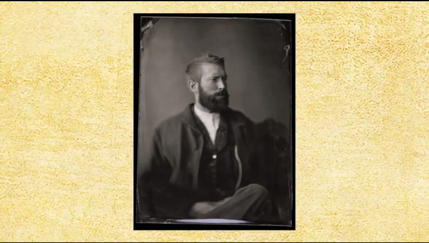
A few months ago i had the pleasure to sit for Fly, a very talented photographer here in Wilmington. You may know him as Harry Taylor. Fly has been crafting some exquisite photos for years now. I have to say that the Tintypes and Ambrotypes Fly has been creating are by far some of the most amazing images i have have the pleasure to feast my eyes on.

I have my father to thanks for my interest in history. Over the years growing our family would take trips to various battlegrounds and places in America's history that, in one way or another, shaped the country that we call home today. Fly helped bring that a bit closer when he asked me, well to be honest it was my beard that he wanted, to sit for a shoot in the forthcoming issue of Our State North Carolina publication. In the Nov issue, Fly's work is the centerpiece of the Civil War story entitled "A Separate Peace".  Again i am honored to be apart of process & to have lent my beard to to this exciting process of picture making.


Below are a few of Fly's tintypes that i have fallen in love with. There is so much more character and personality to these images than you will find in 90% of the photos being taken today.


These last few images are stills taken from the you tube video about the process of making these incredible images. Do yourself a favor and watch the process and then contact Fly for a photo session.


Thanks for stopping by, till next time

TTFN
Doc


Enhanced by Zemanta